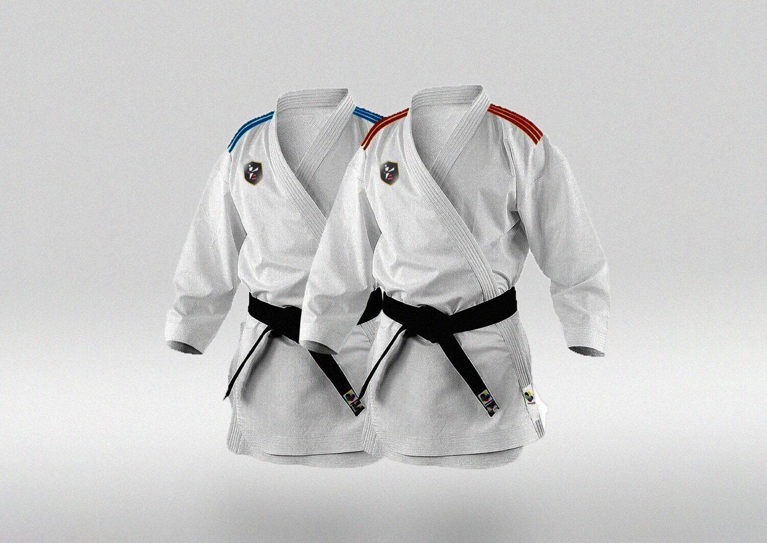
Brand Identity · Logo System · Brand Book
Most martial arts branding reaches for the same shorthand: aggression, speed, a silhouette mid-kick. Elite teaches something broader than fighting, so the identity had to carry discipline and character alongside power. We built a crest where every component answers to one of those ideas.
Elite positions itself as more than a training ground. The academy's own language describes a place for self-discovery and personal growth, where martial arts is a route to discipline and mental resilience rather than an end in itself.
That creates a specific design problem. Lean too hard into power and the brand becomes another gym. Lean too soft and it stops reading as martial arts at all. The identity had to hold both at once, and it had to be defensible rather than decorative.
The six words behind every decision
Structure and repetition, expressed through a strict, rule-based system.
Consistency across every surface, so the brand feels the same everywhere.
The personal growth side of the academy, not just physical capability.
Weight and solidity in the letterforms and the crest silhouette.
The kicking figure, caught at the point of full extension.
The shield, the oldest and most direct symbol available.
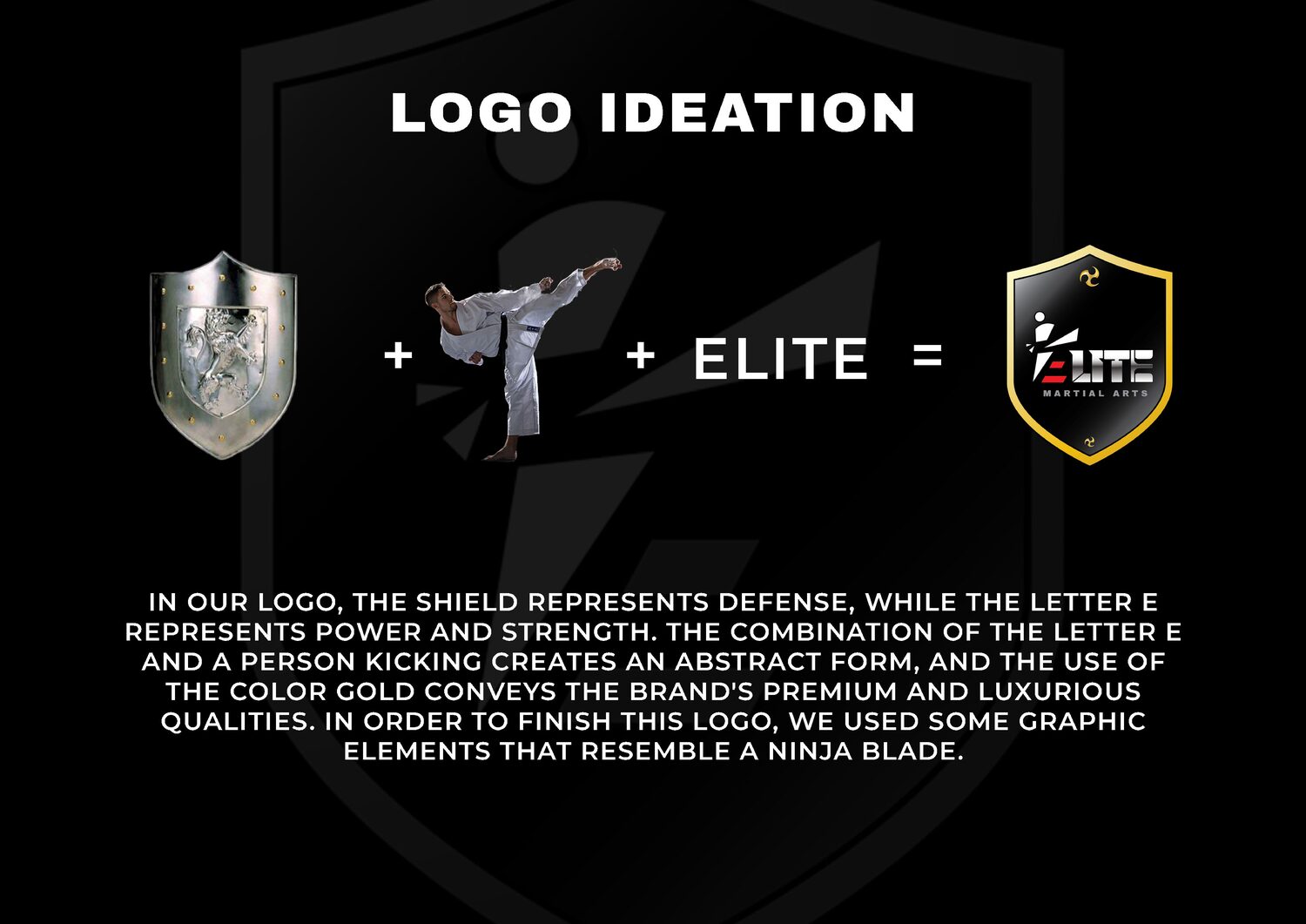
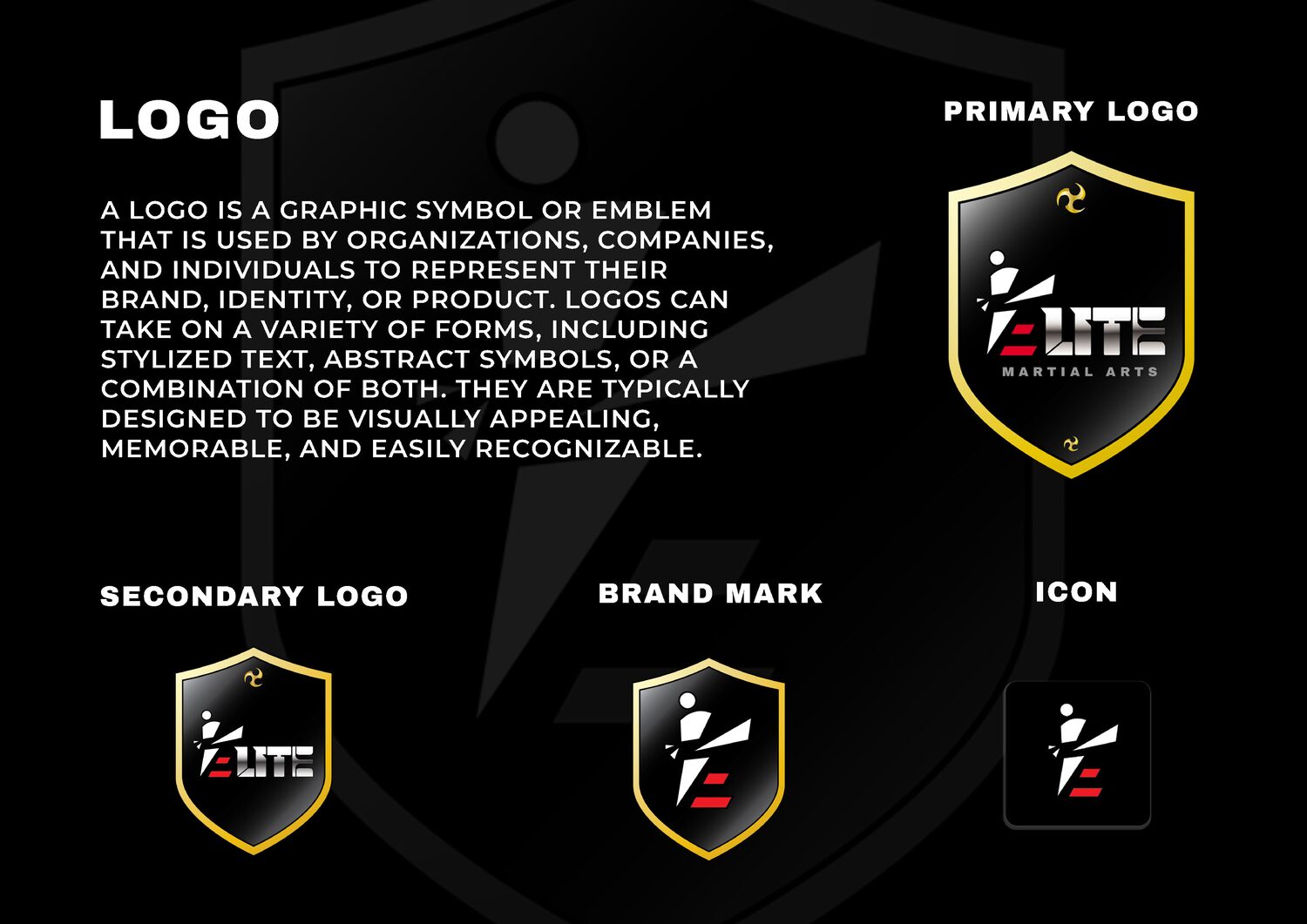
The crest is an assembly, not a drawing. A shield carries defense. The letter E, cut with hard angles, carries power and strength. The E and a kicking figure are resolved into a single abstract form, so the name and the discipline occupy the same shape rather than sitting next to each other.
Gold does the remaining work. In a category dominated by red and black, gold signals the premium end of the market and connects to the tradition of ranking and earned progression that martial arts is built on. Small graphic elements drawn from the profile of a blade finish the crest.
Nothing in the mark is there for decoration. Each element can be pointed at and justified, which is the test we hold every identity to.
A logo that cannot be explained is a preference. A logo that can be explained is an argument.
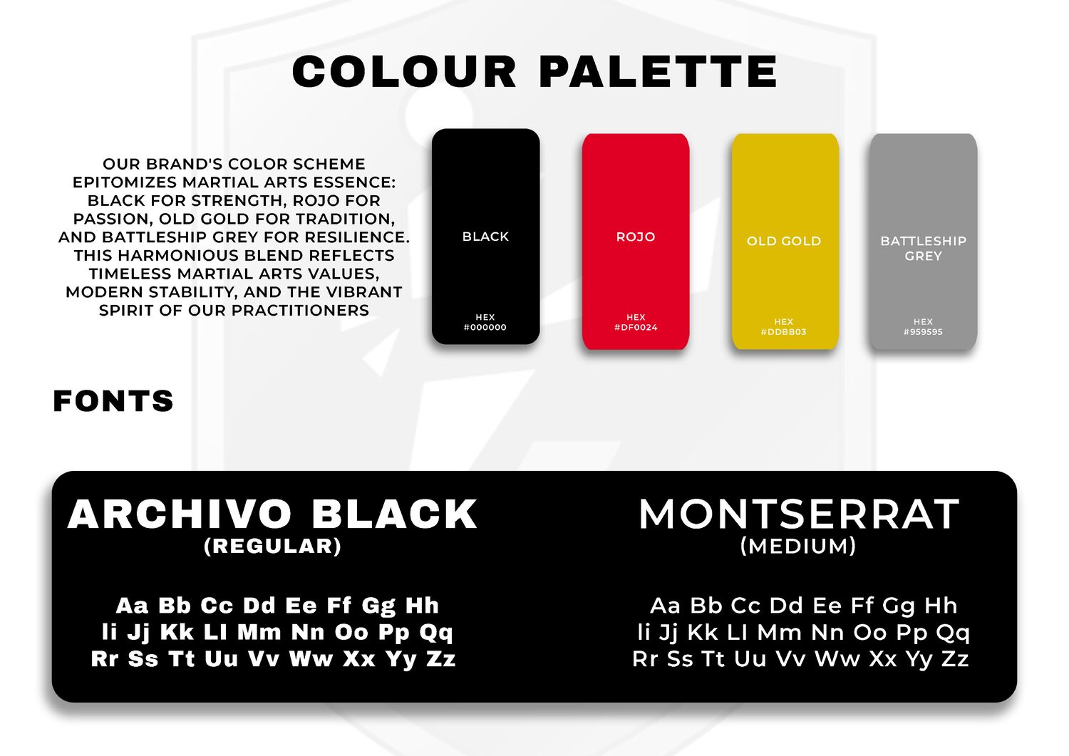
The palette follows the same logic as the mark. Black for strength, red for passion, old gold for tradition, and a battleship grey for resilience. Four colours, four reasons.
Archivo Black handles headlines, chosen for density and flat, uncompromising terminals. Montserrat carries everything else, keeping longer text readable without competing with the display face.
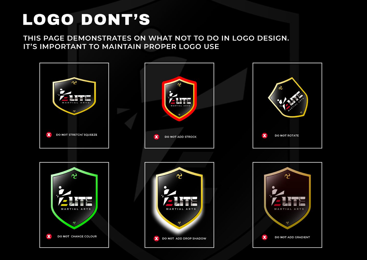
A crest is fragile in the wrong hands. Stretched, rotated, recoloured or given a drop shadow, it stops being the same mark. So the brand book specifies the failure modes as explicitly as the correct usage, because the system only holds if the rules travel with it.

Deliverables