Brand Strategy · Identity · Environment
USMA teaches martial arts to children aged four to twelve in Manchester. Every competitor in the category was selling toughness. The research said the people actually paying were buying something else entirely.
A children's academy has two audiences and only one of them pays. The child has to want to come back. The parent has to sign up, hand over their four year old, and keep paying every month.
So we defined the parent precisely before designing anything: aged twenty-five to forty-five, choosing on behalf of a child aged four to twelve, and weighing the decision against a specific set of concerns.
Safety came first, ahead of everything else. Then friendly, supportive instructors. Then structured progress they could actually see, which is why the belt system matters so much to parents. And underneath all of it, one requirement that contradicted the entire category.
They wanted fun learning. Not strict or intimidating training.
Martial arts branding runs on a fixed set of signals. Black, red, hard angles, a silhouette mid-kick, language built around power and dominance. It works, because it speaks to adults who want to feel formidable.
It is exactly wrong for a parent deciding whether a place is safe for a four year old. Every convention in the category was actively working against the thing the buyer most needed to feel.
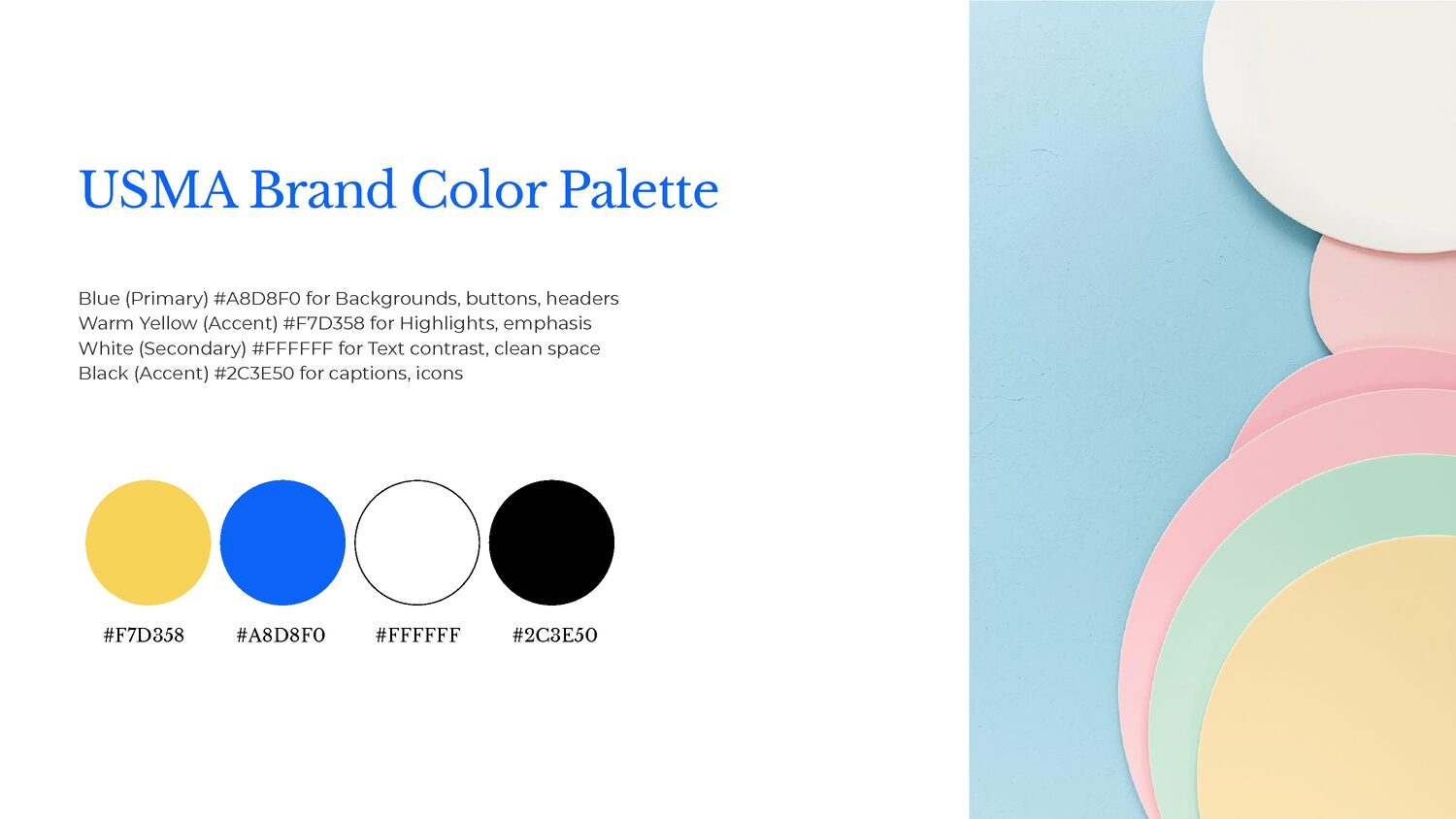
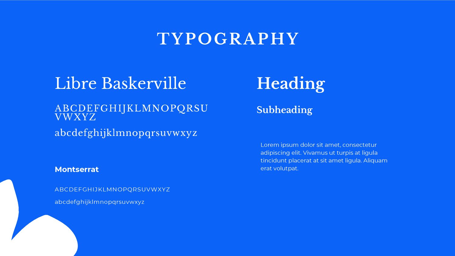
So the identity inverts it. Blue and warm yellow instead of black and red. Rounded, open forms instead of hard angles. A wordmark set in a friendly, readable serif rather than an aggressive display face. Illustration of children training together rather than a lone figure striking.
None of this softens what the academy teaches. It changes who the brand is talking to, which is the person holding the card.

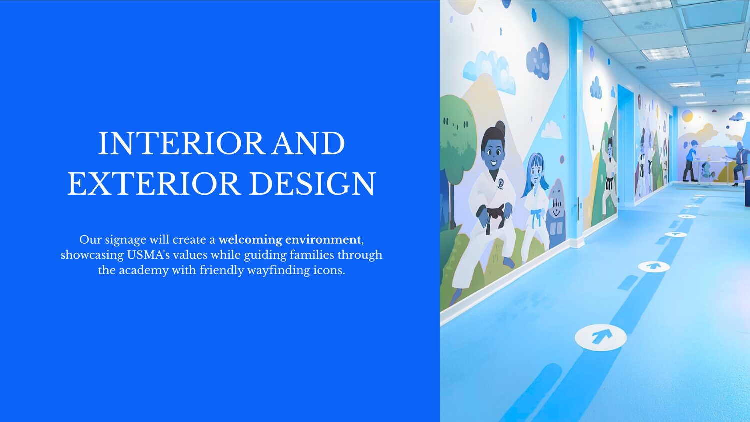
For a local academy, the brand is not experienced as a logo on a screen. It is experienced as a room a parent walks into for the first time, holding their child's hand, deciding in about ten seconds whether this place feels right.
So the largest application is the space itself. Illustrated murals of children training, floor wayfinding that a small child can follow independently, and a colour scheme that reads as a welcoming environment rather than a gym.
The collateral does the practical work: a card that carries the academy's real details, and enrollment material built around the two things parents came for. Strong kids, confident minds.

Deliverables